Whether you’re decorating a new home for the first time or reinventing the familiar spaces you’ve come to know well, you’ve no doubt discovered the importance of color when it comes to starting proceedings. The colors we choose to surround ourselves with can have a profound effect on our lives and the emotions we experience while we’re at home, as well as adding value to properties soon to go on the market, and refreshing spaces we may have become tired of. Inspiration for such big changes can be found everywhere, including magazines, social platforms such as Instagram and Pinterest, and via mood boards created online. However, there’s only one authority when it comes to the colors you should be using next year, and that’s Pantone…
Introducing Pantone’s 2017 color predictions
Pantone is the world number one authority when it comes to color. An organization that effortlessly speaks the language of color, and advises and inspires those hoping to use color to communicate a particular message or promote a brand, Pantone is also a hugely popular source of inspiration for designers, interior designers and artists, and for anyone looking to inject the latest trends into their home or wardrobe. Decorating your home will become an adventure under the guidance of Pantone – particularly when you see 2017’s predictions.
Pantone’s color predictions for 2017 include an array of shades inspired by nature, a collection of colors that will evoke happy memories of warm, spring days, and a hotpot of hues that are bold and dramatic. Sunshine Primrose Yellow, pale blue Island Paradise and tangy Greenery will inspire homeowners and interior designers to play around with colors and accessories, while creating spaces that are warm, inviting, and fun. The earthier tones of Kale green, Niagara blue, Pale Dogwood and Hazelnut, meanwhile, will calm and soothe, instantly transporting the outside in, and inspiring us to head back to nature. Finally, Pantone introduces the bold and seductive colors of Flame, Lapis blue and Pink Yarrow, which will create a statement, anchor any room you choose, and allow your personality to shine.
Exploring color in your home’s decor
There are numerous ways to include a little color in your home, and not all of them will involve an all-out war on the senses. Subtlety is often key when it comes to using color to your home’s advantage, although spreading a little cheer via shades and hues can also be fun.
Light and bright
The light and bright colors predicted by Pantone include Primrose Yellow, Island Paradise and Greenery; three shades set to welcome you home next year. Whether used on your walls, throughout your furniture or as accessories that adorn each room, naturally happy colors such as these will introduce feelings of fun and friendship into your home. One thing that many interior predictions seem to agree on is that 2017 will be the year of escapism; a time where we seek out the corners of our homes that will serve as reading nooks or retreats from technology and work. Primrose and Island Paradise would make excellent choices for such a space, and Greenery will instantly transport exhausted workers into a more refreshing headspace.
Bold and mysterious
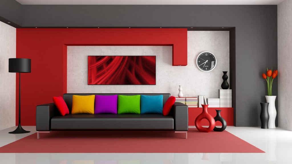
These bold and mysterious colors are destined to introduce drama into your home – a little theatricality that will speak to you each and every day. Such colors are often best presented by way of a feature wall, although the brave among you will no doubt enjoy creating a statement with lashings of Flame Orange or Pink Yarrow – or perhaps a little of each. Pantone’s predictions for such dominating colors prove that homeowners and interior designers are still looking for ways to anchor spaces and draw themes together, and you’ll no doubt enjoy exploring the different ways that such tones can be used together. It’s time to play with accessories; decorative shutters in shades of orange or Lapis Blue will look fantastic against next year’s trend for terracotta and exposed brickwork, while upholstered bedheads and soft furnishings allow the faint of heart to introduce colors gradually, and with gathering confidence.
Down to earth
Bringing the outdoors in, and described by Pantone’s Executive Director, Leatrice Eiseman, as “oxygenating”, colors such as Kale, Niagara Blue, Pale Dogwood and Hazelnut will encourage homeowners to breathe a little more deeply and to take stock of the things that are important. Shades of Hazelnut and Pale Dogwood will work well on your walls, evoking feelings of quiet contemplation and calm. The darker hues of Niagara Blue and Kale, meanwhile, are designed to make more of a statement. Used in your furniture, accessories and artwork, Kale in particular conjures a passion for the great outdoors, and would look fantastic when used for a feature wall. These colors are immersed in nature, centering and grounding us. Why not introduce earthy accessories, soft furnishings or artwork into your bedroom to create a soothing space you’ll long to retreat to?
When it comes to interior design and refreshing the rooms of your home, there are no right or wrong answers. Choosing colors for your walls, furniture, soft furnishings and accessories should be a personal choice based on the shades you’re passionate about, the theme you’d like to evoke, and the way you want to feel upon entering that space. Pantone is an organization that really knows its stuff when it comes to color, and we hope you’ve been inspired to create the home of your dreams during 2017.
